
Aggregating Points into a Density Heatmap
Your scatter plot draws a million points, the centre is a solid opaque blob, and no one can tell whether that mass is ten thousand points or half the dataset — overplotting has destroyed the very distribution you wanted to show.
The remedy is to stop drawing individual points and start drawing how many fall in each region: bin the cloud into a 2D grid or hexagonal lattice, count the points per cell, and map those counts to colour. This page is a companion within large-dataset rendering strategies and the aggregation counterpart to LTTB downsampling: a line downsamples because it has one path to preserve, but a scattered cloud has no path, so you summarise its density instead. The output is a fixed grid of a few thousand cells no matter whether the input was a million points or a hundred million.
Diagnostic checklist
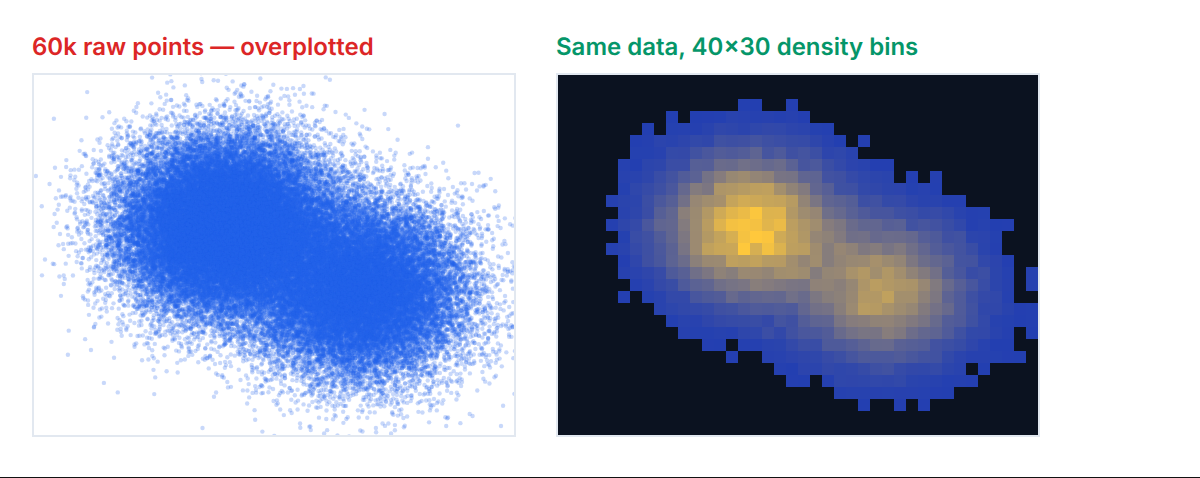
Broken vs fixed
// ❌ BROKEN: draw a million semi-transparent dots and hope density "reads".
function overplot(ctx: CanvasRenderingContext2D, pts: readonly Point[]): void {
  ctx.fillStyle = "rgba(30,41,59,0.05)";
  for (const p of pts) {                     // a million fill calls per frame
    ctx.beginPath();
    ctx.arc(p.x, p.y, 2, 0, Math.PI * 2);
    ctx.fill();                               // centre saturates to opaque; density lost
  }
}
// ✅ FIXED: bin into a grid once, draw one rect per occupied cell.
interface Point { x: number; y: number }
function binToGrid(pts: readonly Point[], w: number, h: number, cell: number): Uint32Array {
const cols: number = Math.ceil(w / cell);
const rows: number = Math.ceil(h / cell);
const counts = new Uint32Array(cols * rows); // pre-allocated, GC-free
for (const p of pts) { // single O(n) pass
const cx: number = (p.x / cell) | 0;
const cy: number = (p.y / cell) | 0;
if (cx >= 0 && cx < cols && cy >= 0 && cy < rows) counts[cy * cols + cx]++;
}
return counts; // <= cols*rows cells, not n points
}
function drawHeatmap(ctx: CanvasRenderingContext2D, counts: Uint32Array, cols: number, cell: number): void {
let max = 0;
for (const c of counts) if (c > max) max = c;
// PERF: log transform so a few dense cells do not flatten every sparse one.
const norm: number = Math.log1p(max) || 1;
for (let i = 0; i < counts.length; i++) {
if (counts[i] === 0) continue; // skip empty cells entirely
const t: number = Math.log1p(counts[i]) / norm;
ctx.fillStyle = viridis(t); // A11Y: perceptually uniform, colourblind-safer
ctx.fillRect((i % cols) * cell, ((i / cols) | 0) * cell, cell, cell);
}
}
declare function viridis(t: number): string;The transformation collapses cost twice over. The binning pass is O(n) but writes into a fixed Uint32Array whose size is set by the grid, not the dataset, so a million points and a hundred million points both produce the same few-thousand-cell grid. The draw then iterates cells, not points: at a cell size of four pixels a 800×600 chart has 30,000 cells, of which only the occupied ones are filled — a couple of orders of magnitude fewer draw calls than one-per-point. Density becomes an explicit, measurable count rather than an emergent property of overlapping alpha that saturates to opaque and lies about the peak.
Step-by-step fix
function aggregateForView(pts: readonly Point[], w: number, h: number): { counts: Uint32Array; cols: number; cell: number } {
  const cell = 4;                              // px per cell
  const cols: number = Math.ceil(w / cell);
  return { counts: binToGrid(pts, w, h, cell), cols, cell }; // run on view change, cache
}
Verification
const pts: Point[] = Array.from({ length: 1_000_000 }, () => ({ x: Math.random() * 800, y: Math.random() * 600 }));
const counts: Uint32Array = binToGrid(pts, 800, 600, 4);
let total = 0;
for (const c of counts) total += c;
console.assert(total === pts.length, `counts sum ${total} != point count ${pts.length}`);
console.assert(counts.length === Math.ceil(800 / 4) * Math.ceil(600 / 4), "grid dimensions wrong");
The count array must sum to the number of in-bounds points — that conservation check catches off-by-one binning and clamping bugs immediately. In DevTools, profile the draw call: fill count should equal the number of occupied cells (a few thousand), not the point count, confirming the aggregation reached the renderer rather than the raw cloud.
Square grid versus hexbin, and colour honesty
Square cells are simplest and map to fillRect directly, but the grid’s axis-aligned edges can create visual banding along rows and columns. Hexagonal bins pack more uniformly — each hexagon has six equidistant neighbours rather than a mix of edge and corner adjacencies — so density gradients read more smoothly, at the cost of a slightly more involved point-to-cell mapping (offset every other row and pick the nearest hex centre). For exploratory density where the eye follows gradients, hexbin usually looks better; for a heatmap that will be read cell-by-cell or exported to a grid, squares are clearer.
The colour scale is where a density heatmap most often misleads. A rainbow scale invents perceptual boundaries — the eye reads the green-to-cyan transition as a sharper step than the equal numeric step from red to orange — so it fabricates structure that is not in the data. A perceptually uniform sequential scale such as viridis or magma keeps equal count differences looking equal, and both remain distinguishable under the common forms of colour-vision deficiency. Choosing one is the same discipline covered in colorblind-safe palettes for categorical data, applied to a sequential rather than categorical encoding. Pair the scale with a log or square-root count transform whenever a handful of cells dwarf the rest, or those few peaks compress every other cell into the same near-empty colour.
Edge cases & gotchas
- Empty cells versus zero counts. Skip empty cells entirely rather than painting them the scale’s minimum colour, or a sparse plot fills with a wash that hides where data actually is.
- A single dominant cell. One extreme bin sets the max and flattens everything else to near-zero colour; a log transform or a clipped percentile max restores contrast.
- Cell size and zoom. Binning at a fixed data-space cell size makes cells grow and shrink on zoom; bin in screen pixels and re-aggregate per view so cell size stays constant on screen.
- Points on cell borders. Consistent floor-based mapping avoids double-counting, but be explicit about the half-open interval so a point exactly on a boundary lands in one cell only.
- Weighted points. If points carry a value (not just presence), accumulate the sum and a count per cell and divide for a mean-density heatmap; a plain increment answers a different question.
- Antialiasing seams. Drawing adjacent
fillRectcells with default antialiasing leaves faint gaps; disable image smoothing or overlap cells by a fraction of a pixel to close them.
Frequently Asked Questions
When should I aggregate instead of downsample?
Aggregate when the data is a scattered cloud with no single path to trace — many points sharing similar x-values with different y-values, where the interesting quantity is how many points fall where. Downsample when the data is a connected series with one value per position, like a time series, where LTTB can keep a representative subset of real samples. The mark geometry decides: a cloud aggregates, a line downsamples.
Why does my colour scale choice matter so much?
Because a heatmap encodes its entire message in colour, and a non-uniform scale like rainbow makes equal count differences look unequal, inventing boundaries the data does not contain. A perceptually uniform sequential scale keeps equal steps looking equal and stays legible for colourblind viewers. Combined with a log or square-root transform for skewed counts, it keeps the density honest.
How big should each bin be?
Tie the cell size to a few screen pixels so the grid resolution matches what the display can resolve — around three to six pixels is a common sweet spot. Smaller cells reintroduce the noise you were trying to smooth and produce many single-point bins; larger cells blur genuine structure. Because it is screen-relative, re-aggregate on zoom so the on-screen cell size stays constant.
Related
- Large-Dataset Rendering Strategies — the parent guide to reduction techniques.
- Downsampling Time Series with LTTB — the reduction for connected lines rather than clouds.
- Colorblind-Safe Palettes for Categorical Data — the same colour discipline for categorical encodings.
- Rendering 100k Scatter Points Without Frame Drops — when you must draw individual points after all.